This student project examined a theorhetical re–branding of Athens, Greece. The intended audience longs for some time to themselves and to get away from their responsibilities. With that in mind, the goal was always to give a feeling of a romantic and worry–free city. Every aspect of the re–branding is used to create a cohesive feeling, from the hand–stitching to the visual theme. Each part of the new brand was meant to show people what they are missing by not being in Athens right now.
All of the new brand elements were meant to represent the seas that surround Athens. The new brand feels light, airy, and relaxing.
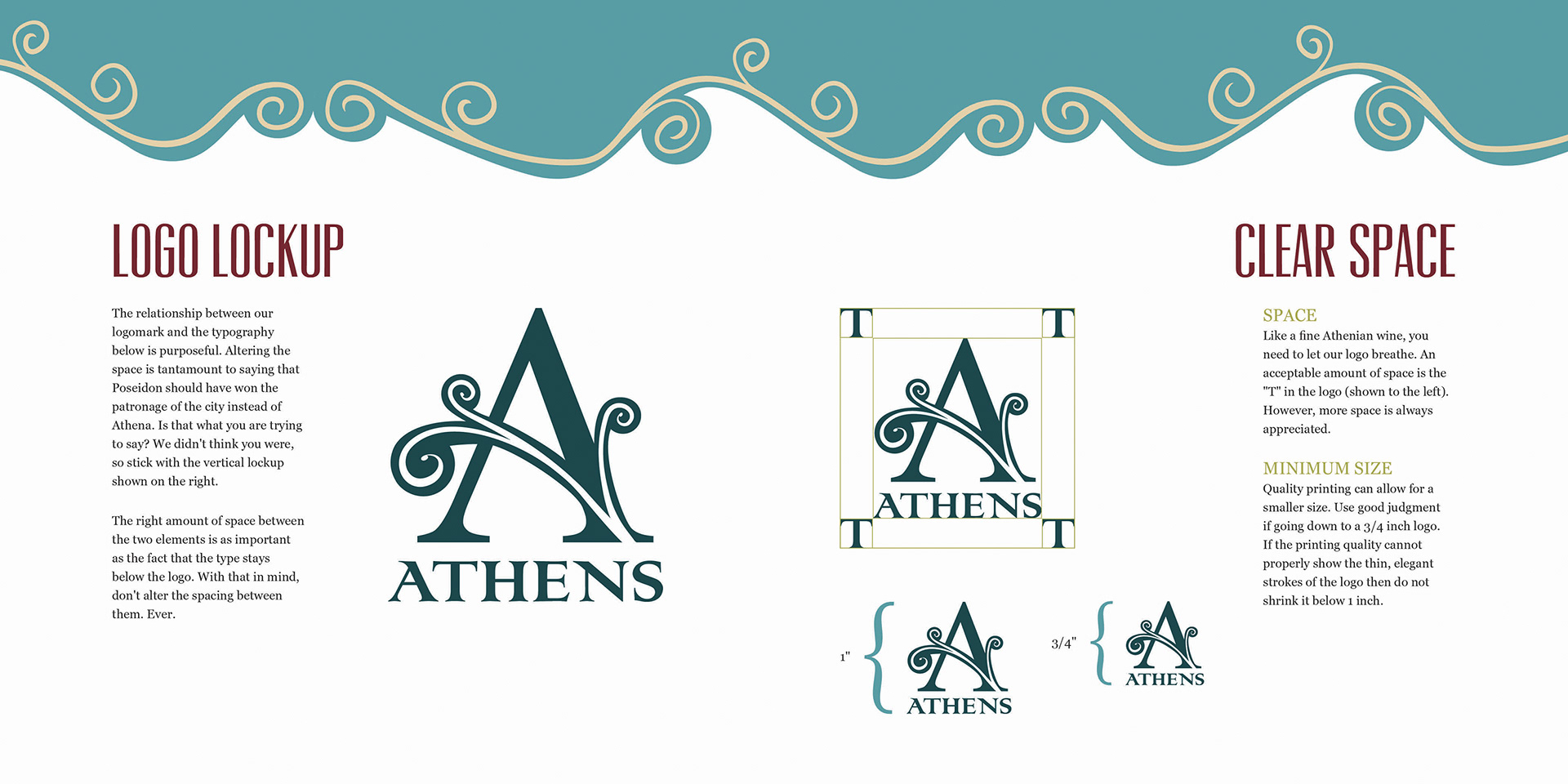
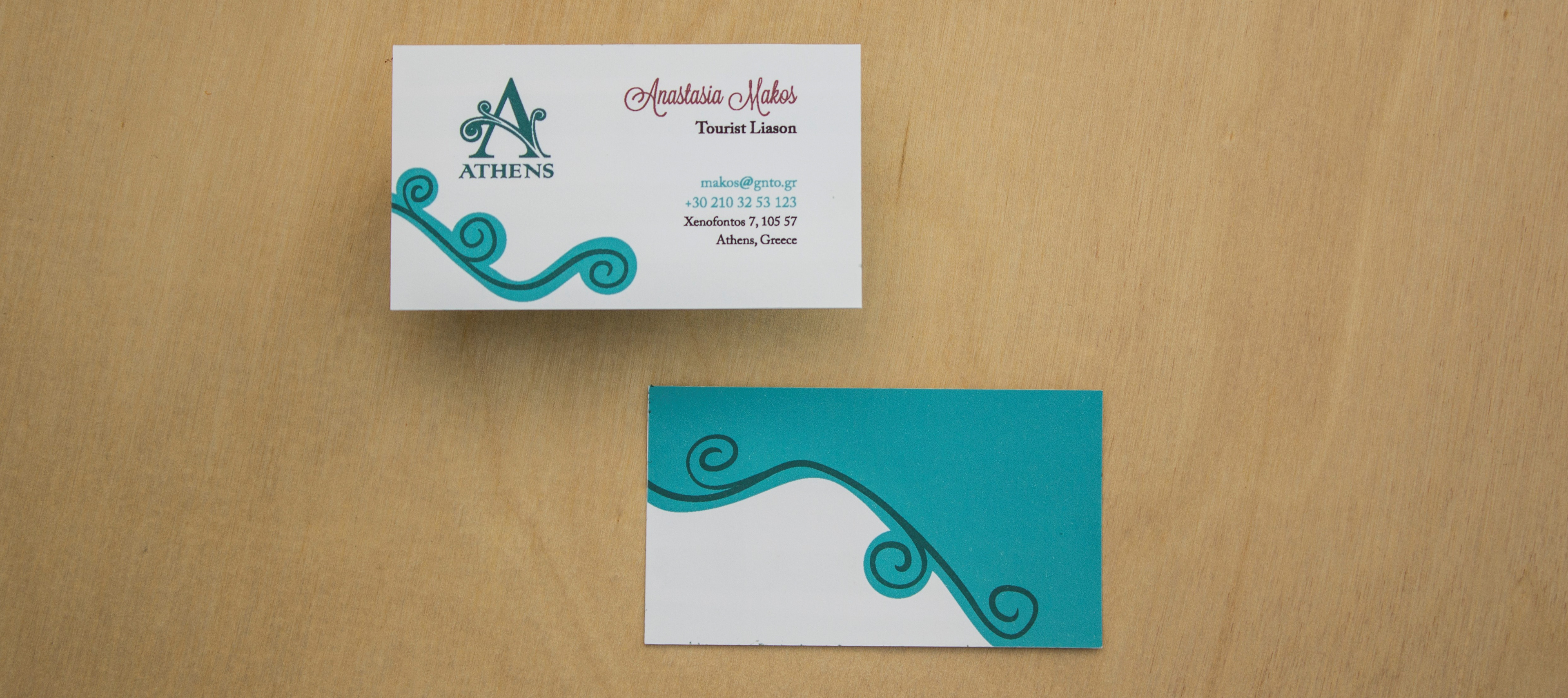
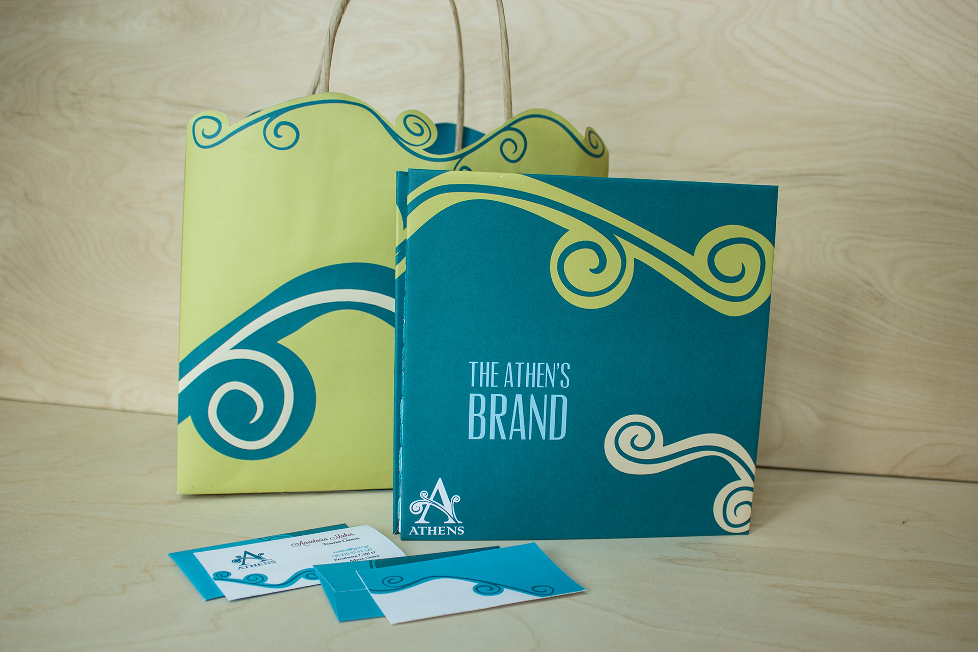
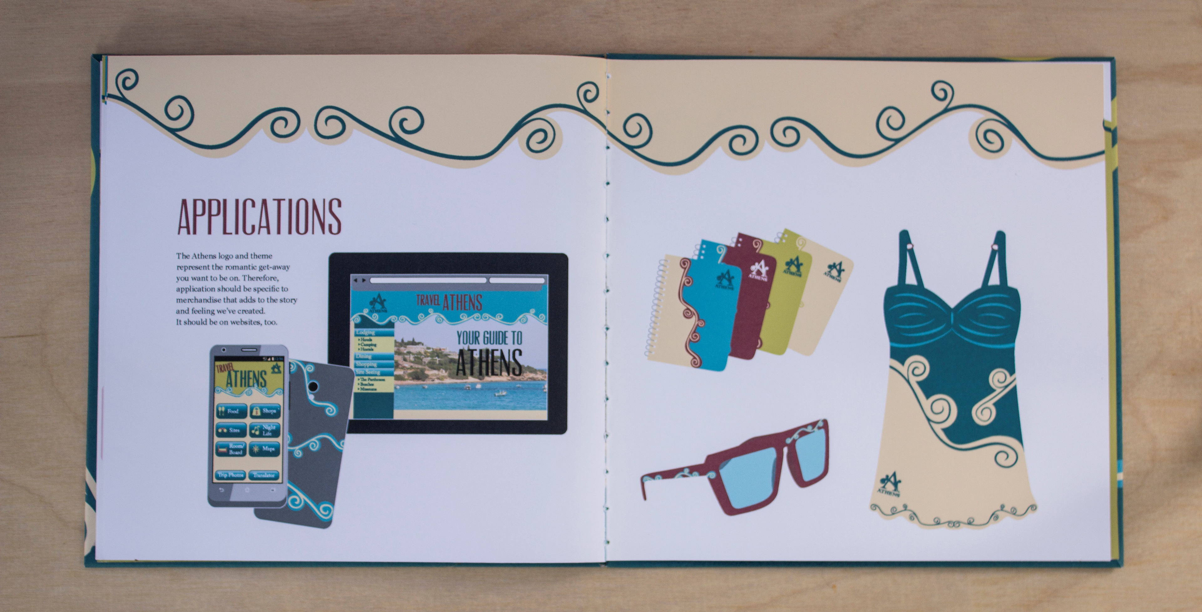
Re-branding included a new logo, color scheme, and visual theme. The applications spread below illustrates examples for using the new visual theme to create brand merchandise and corresponding applications.
The color palette is a good example of the new brand personality coming through. Each color is named with an Athenian theme. There is humor and whimsy in most of the book. We don't want tourists to take themselves too seriously on vacation in Athens, so we lead by example.

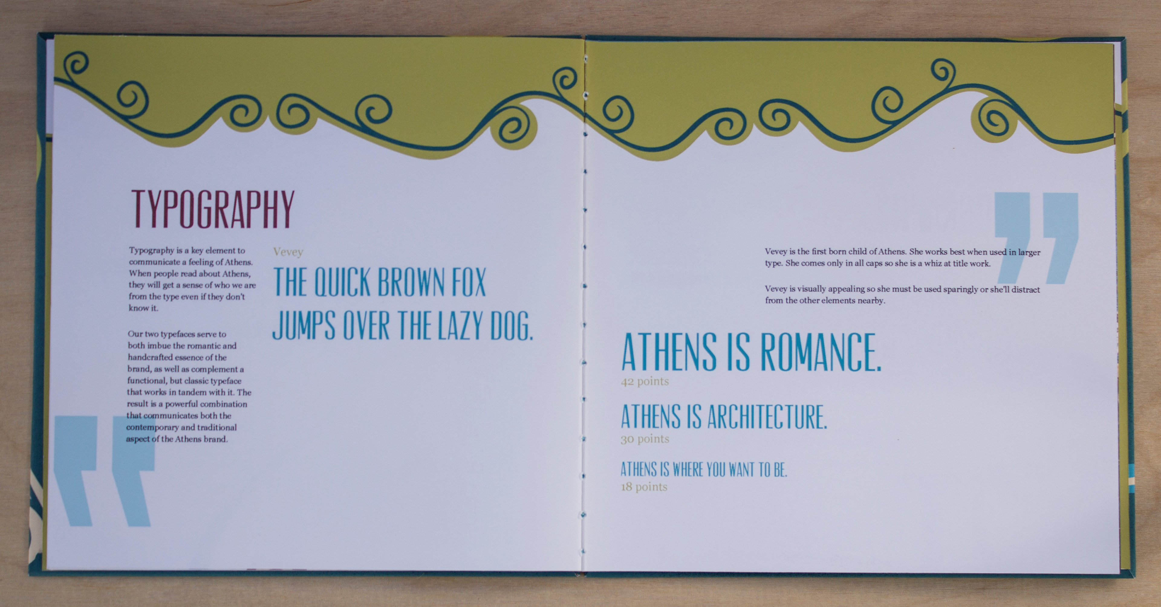
Typefaces were carefully chosen to enhance the new brand personality.