This student project is a re-design of a magazine about homebrewing. The content was thorough, but it lacked design. The goal of the re-design was to appeal to a larger audience and give it the feel of a modern magazine.

The magazine as a whole did not contain many pictures and was very text heavy. We begin the transformation by adding visuals in the table of content. Many of the photographs were taken by me.

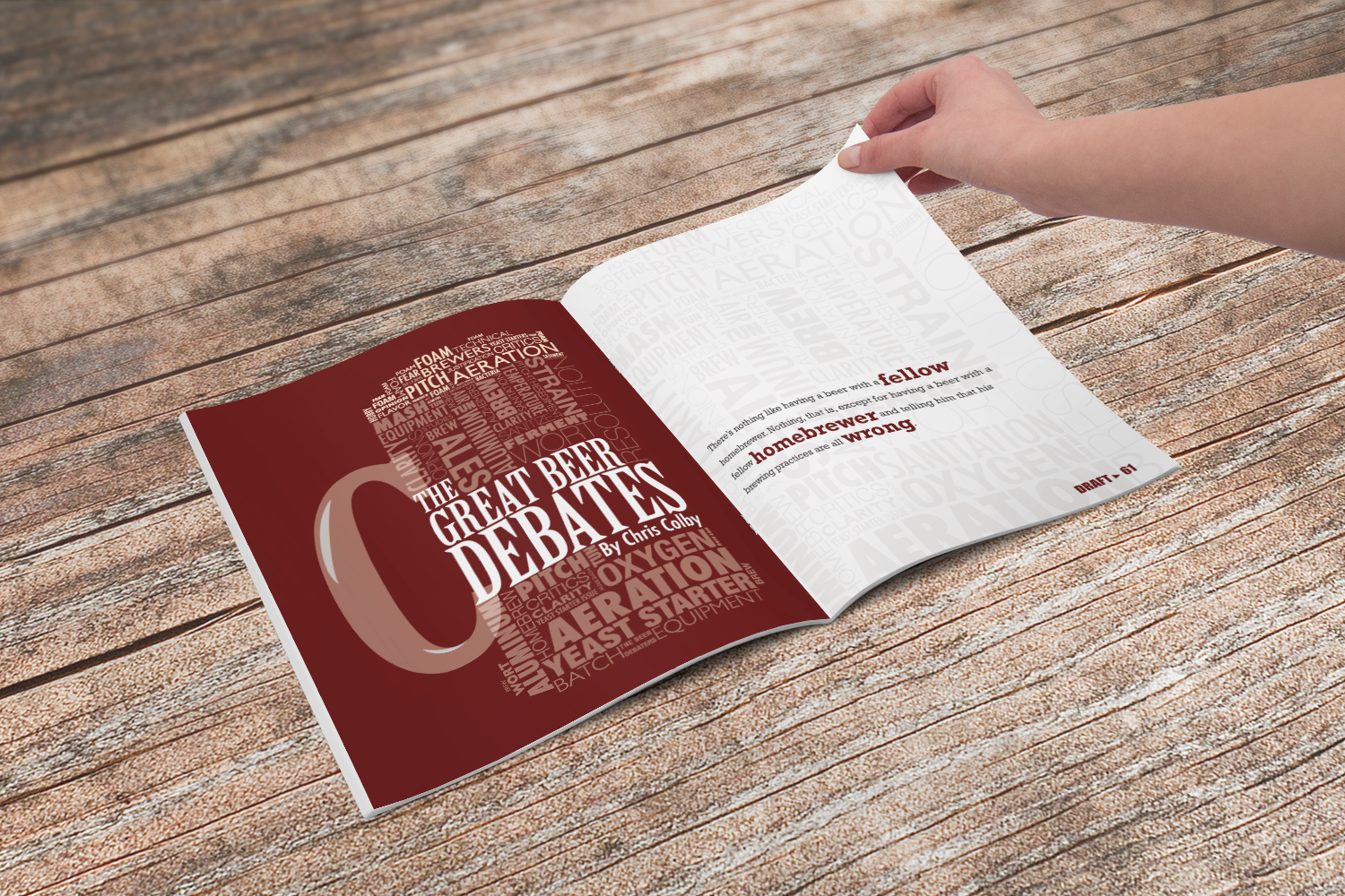
This spread was a little bit of a typographic expiriment, but it incorporates some of the key terms in the article on the next two-page spread.