Core Alchemy Cider had a strong theme which I found very fun to work with. My participation included developing all elements of the brand including logo, bottle labels, brand guidelines, and various collateral.
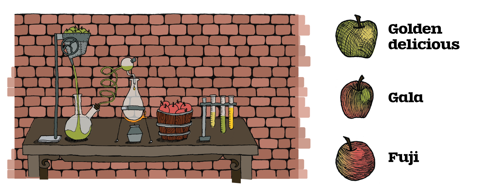
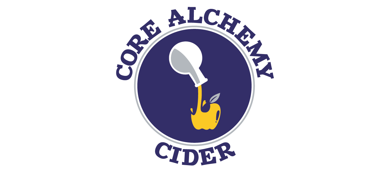
The brand theme was based on an alchemist who was experimenting with cider brewing and discovering delicious fermentations, documenting them during the process. Each part of the brand came together to reinforce this idea. The logo was meant to show the alchemical process, creating liquid gold (sort of the motto for the brand). The colors chosen were meant to represent metal colors, often associated with alchemy. The dark blue adds a touch of import and is a good compliment to the grey (silver) and golden yellow (gold).
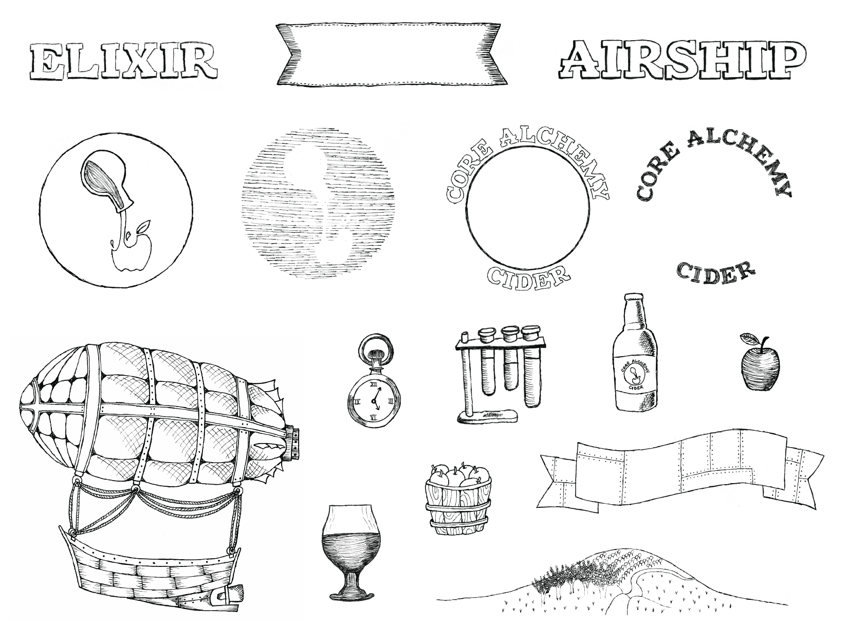
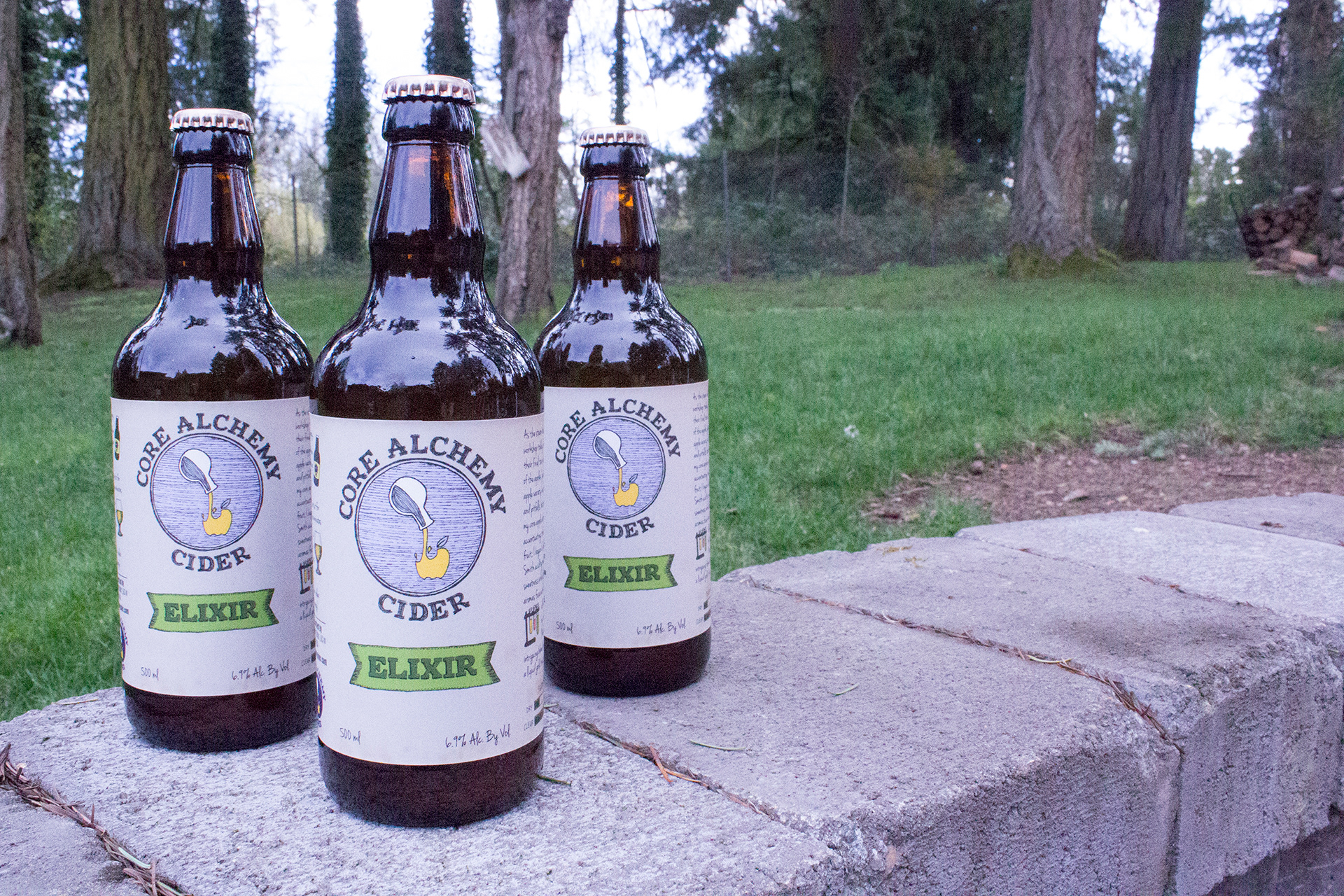
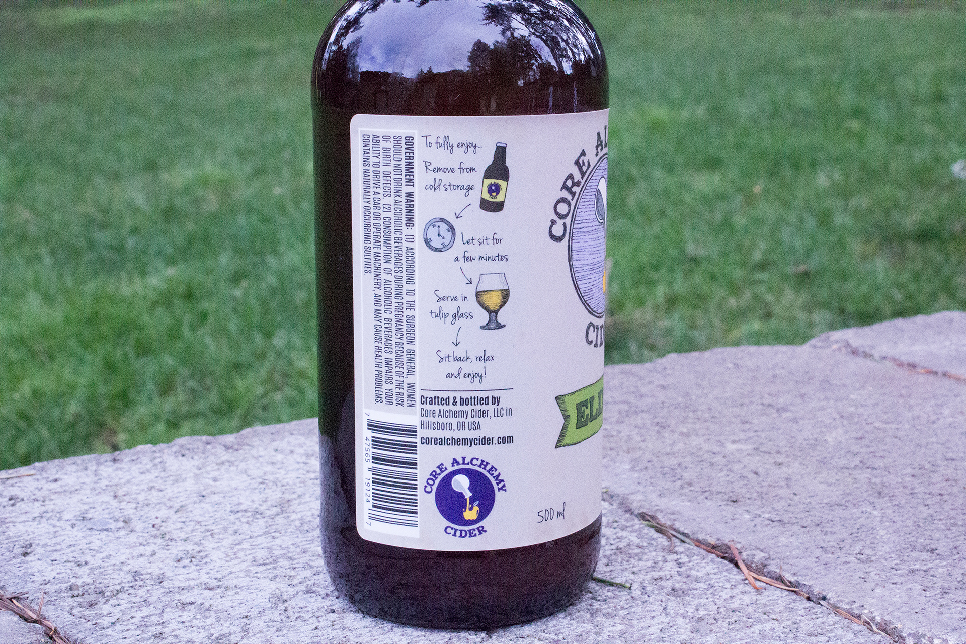
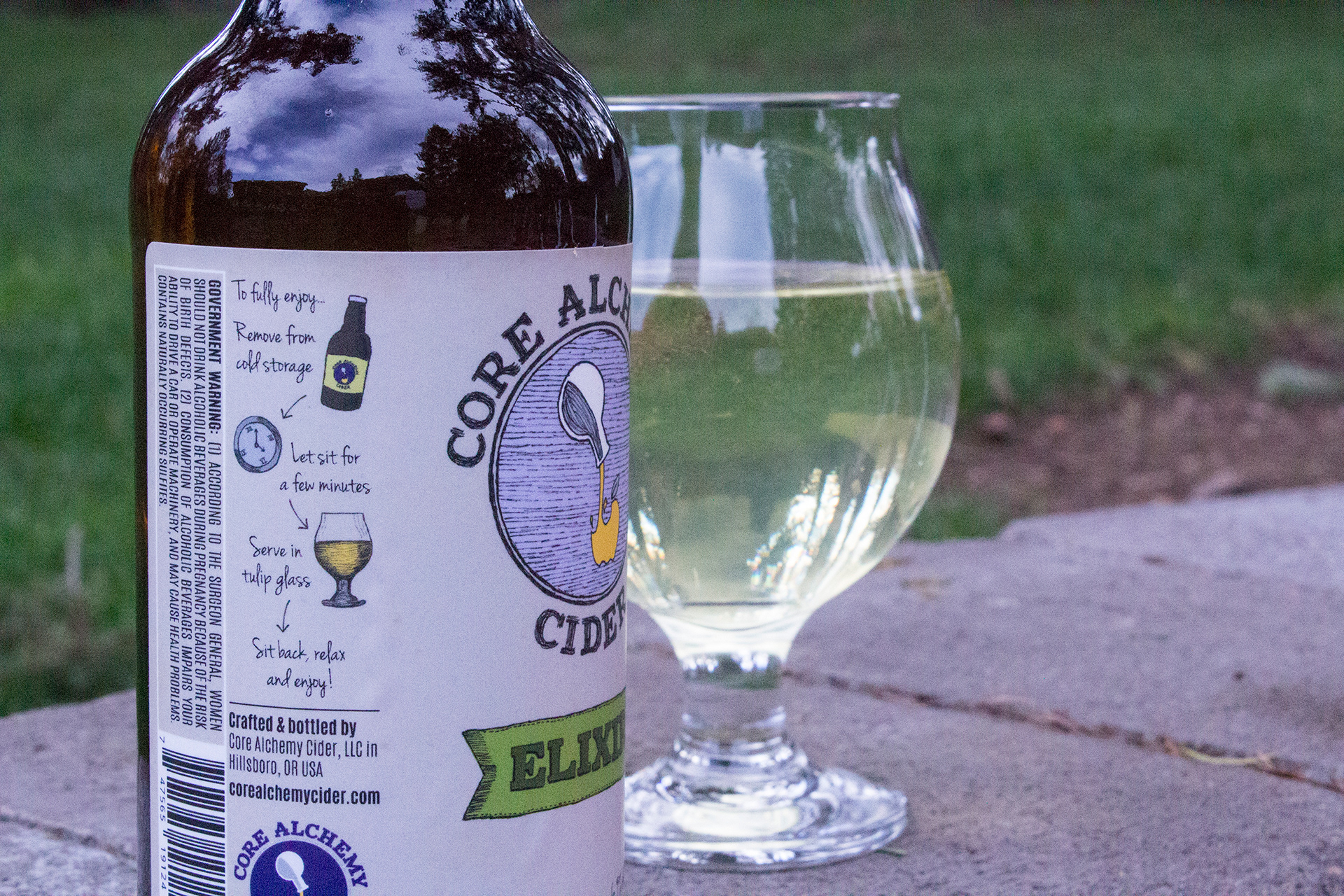
The bottles were where the theme really came through. Each label is meant to look like a page from the alchemist's sketchbook; his discoveries documented on the bottles that contained his creations. Every element on the bottle was hand-drawn to reinforce the sketchbook idea and there were notes from the alchemist. The very first bottle, Elixir, included a hand-drawn version of the logo, meant to be the introduction to the brand as the alchemist was discovering his talent and deciding to bottle his creations.

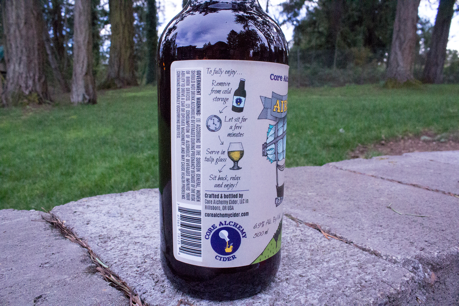
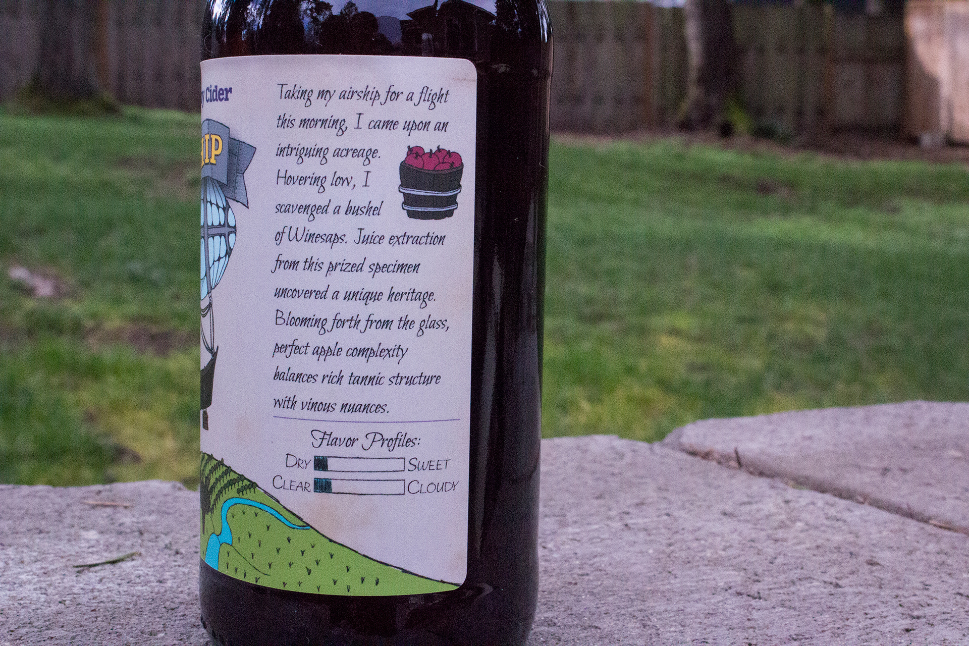
The second cider, Airship, provided an opportunity to set the stage for the newest flavor at the time of its creation. I designed landscape imagery to match the story on the bottle and create a sense of being immersed in the alchemist's story. Airship matched Elixer in general layout to create a connection between the two. If you saw them both on the shelf, you'd know they were the same brand.

All of the elements were hand-drawn, scanned into the computer, then color was added digitally. Below are some of the hand-drawn elements, including some ideas that didn't make it to final production.