The 2016 resident camp season brought about some exciting re-design opportunities for the Girl Scouts OSW resident camp brochure and other collateral. Before planning for 2016 camps, a camp program expert examined our camp structure and facilities. The camp brochure would be the first touch point for potential campers and their parents to see what changes were made for this year.
This brochure and collective marketing resulted in our council exceeding our camp registration targets for that summer (ahead of schedule!).

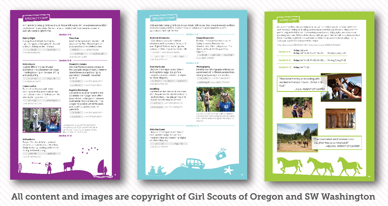
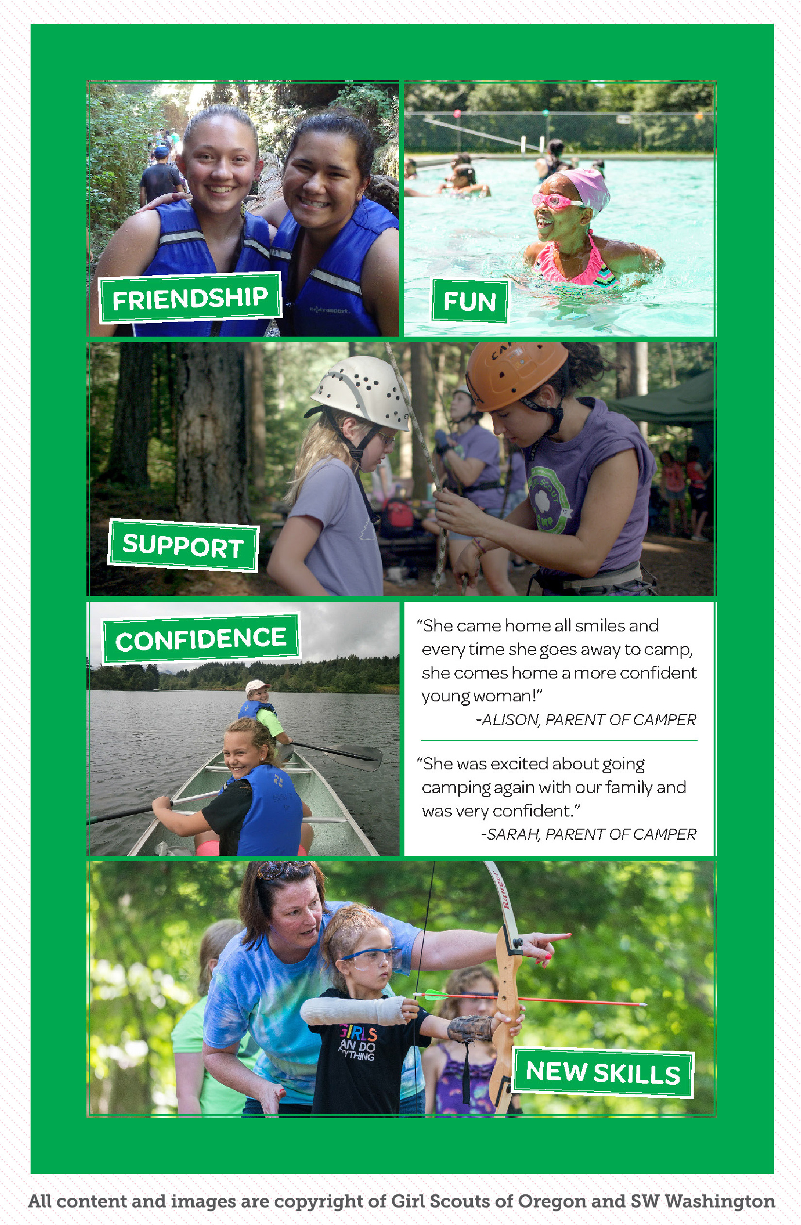
The brochure needed a restructure based on program changes and suggestions made by the camp expert, including re-thinking our main audience. With the new information that moms were the main audience, we were able to focus on what they look for when they are choosing summer activities for their daughter. We tried to incorporate a lot of pictures to show moms what Girl Scouts OSW camps have to offer. This was a fun creative challenge as the re-design also meant that we didn’t have as much page space but we did have more content.
The brochure re-design offered a great opportunity to present personalities for our camps that hadn’t been established before. Each camp now has their own color (chosen from colors in the Girl Scout palette) that relates to the overall camp character which will be established throughout the rest of the camp collateral. The colors and some other branding will be developed during the 2016 camp season and will be carried forward in future years. This will help reinforce the Girl Scouts OSW brand while creating stronger branding for each of the camps, which hasn’t been done previously. The goal is for campers to be able to easily identify with their favorite camp and keep a strong connection as they go to camp each year. Differentiating the camps from one another will help them to feel more special.
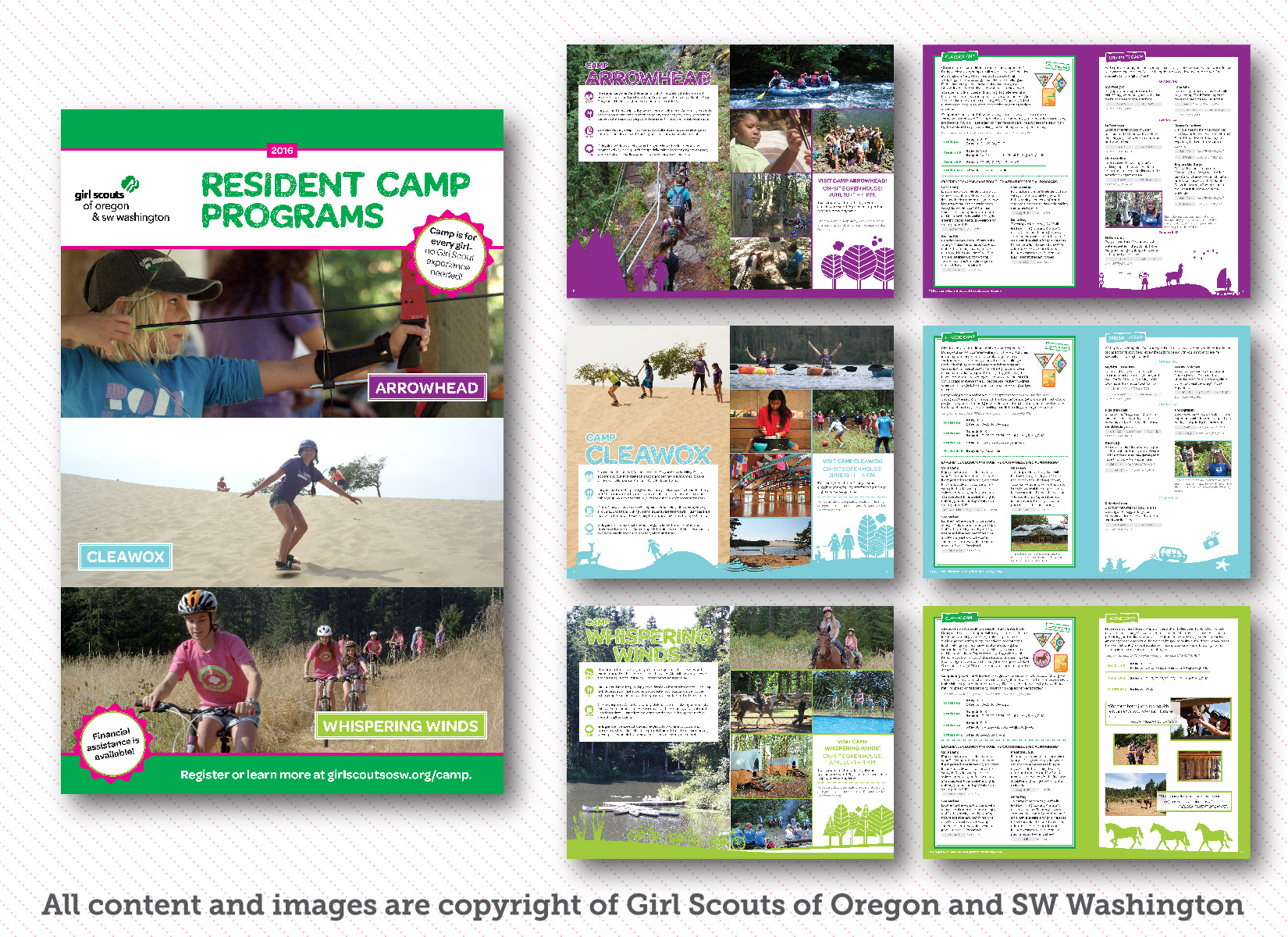
Part of Girl Scouts OSW branding is the feeling of fun. The new brochure has a good feeling of fun with illustrations that relate to each camp and included activities that girls could identify as being specific to their camp. This was a solution created to balance the need for more photos with fun elements that would get a girls attention when she sits down with her mom to choose camps.